
A high-converting website is a website that turns visitors into real action. That action could be a contact form submission, a booked call, a purchase, or a new lead. The website does not just look good. It helps people trust your business and feel ready to take the next step.
A lot of businesses think their problem is traffic. They focus on SEO, ads, or social media to bring in more visitors. But traffic is only part of the problem. If your website feels confusing, generic, slow, or unclear, people leave without contacting you.
The best high-converting websites guide people from interest to action. They explain what you do, why it matters, and what someone should do next. They remove doubt, build trust, and make the decision easier.
What Does “High-Converting” Actually Mean?
A high-converting website is a website that gets people to do something valuable for your business. That action is called a conversion.
For one business, a conversion could be a contact form submission. For another, it could be a booked call, a product purchase, an email signup, or a new lead.
The important thing is that the website moves people closer to becoming a customer.
A lot of business owners think a website is successful because it looks modern or gets traffic. But neither of those things automatically means the website is working.
A beautiful website can still fail if people do not understand what you do, do not trust your business, or do not know what to do next.
A high-converting website is not only about design. It is about clear messaging, trust, easy navigation, and strong calls-to-action that help people move forward.
Why Most Websites Fail to Convert
Most websites do not fail because the business is bad. They fail because the website makes people work too hard.
Some websites have too much clutter. There are too many sections, too many colors, too many buttons, and too much text fighting for attention. People land on the page and do not know where to look first.
Other websites fail because the messaging is weak. The homepage says things like “We provide quality solutions” or “We help businesses grow.” That means nothing. If someone cannot understand what you do in a few seconds, they leave.
A lot of websites also feel cold. They explain services, but they never create an emotional connection. They do not show why the business exists, who it helps, or why someone should care. That is one reason story-driven websites often perform better.
Many websites also make the mistake of giving people no clear next step. Visitors should never have to guess whether they should call, book, buy, or send a message.
And then there is mobile. A website can look great on a laptop and still be frustrating on a phone. Slow pages, broken layouts, tiny buttons, and hard-to-read text push people away fast.
The Psychology Behind High-Converting Websites
People do not make decisions only with logic. They make decisions based on trust, emotion, and how easy something feels.
Trust is one of the biggest reasons someone chooses to contact a business. If your website looks outdated, has no testimonials, no real photos, no clear contact information, or no proof of past work, people become hesitant.
Clarity matters just as much. Visitors should understand what you do, who you help, and what they should do next within a few seconds. If people feel confused, they leave.
Simplicity also plays a big role. A clean layout, fewer choices, and clear calls-to-action help people make decisions faster. Too many options often create hesitation.
Familiarity matters because people trust what feels normal and easy to use. Clear navigation, recognizable buttons, simple layouts, and predictable page structure make people feel comfortable.
Social proof is another major factor. Reviews, testimonials, client logos, case studies, and before-and-after results show people that others already trust your business.
And then there is emotion. People want to feel understood. They want to feel confident that your business can solve their problem. That is why story-driven websites often convert better than websites that only list services.
User behavior also matters here. The way people scan, scroll, click, and move through a page can have a huge impact on conversion. That is where “How Do Users Actually Read and Interact With Websites?” can support this section later.
The Structure of a High-Converting Website
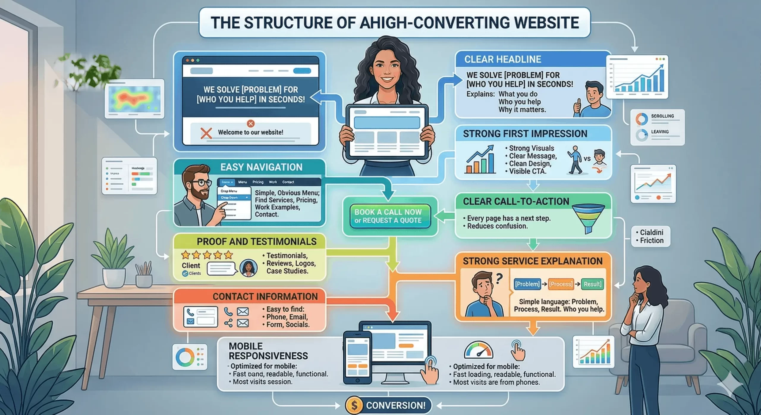
A visual breakdown of the key elements and strategies necessary to create a website that turns visitors into customers, based on high-converting website principles.
Clear Headline
Your headline is usually the first thing people read. It should explain what you do, who you help, and why it matters. Generic headlines like “Welcome to Our Website” or “We Help Businesses Grow” are too vague. People should understand your value within a few seconds.
Strong First Impression
The top section of your website shapes how people feel about your business. Strong visuals, a clear message, clean design, and a visible call-to-action help people stay longer. Weak first impressions make people leave before they even scroll.
Easy Navigation
People should never have to search for important pages. Your navigation should feel simple and obvious. Keep the main menu short. Make it easy to find services, pricing, work examples, and contact details.
Clear Call-to-Action
Every page should tell people what to do next. That could be booking a call, filling out a form, requesting a quote, or making a purchase. A website with no clear next step creates confusion.
Proof and Testimonials
People trust other people more than they trust marketing. Testimonials, reviews, client logos, case studies, before-and-after examples, and real results help reduce doubt.
Strong Service Explanation
Do not assume people already understand your offer. Explain what you do in simple language. Focus on the problem you solve, who you help, and what the process looks like.
Contact Information
Make it easy for people to contact you. Your phone number, email, contact form, and social links should be easy to find. If people have to search for a way to reach you, some of them will leave.
Mobile Responsiveness
Most people will visit your website from a phone. If the website is slow, hard to read, difficult to navigate, or broken on mobile, conversions drop fast.
You can test your website speed with Google PageSpeed Insights to see if slow loading times are hurting conversions.
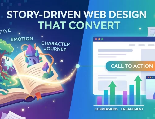
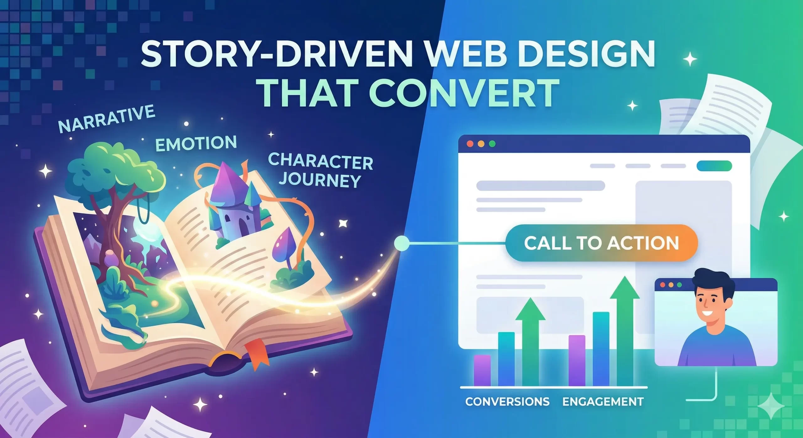
Why Storytelling Improves Conversion
People remember stories more than features, services, or sales copy. A website that only lists what a business does can feel cold and forgettable. A website with a story feels more human.
Storytelling creates emotional connection. It helps people understand who you are, why your business exists, what problem you solve, and why you care about it. That emotional connection makes people more likely to trust you.
Story also keeps people engaged for longer. Instead of jumping from headline to headline, visitors start following the journey. They want to know what makes your business different, who you help, and what results you create.
A good story also helps people understand why they should care. Most businesses talk too much about themselves. They list services, awards, and features. But customers care more about their own problem. Storytelling helps connect your business to the customer’s situation.
That is one reason story-driven websites often convert better than generic template websites. They feel more personal, more memorable, and more believable.
At Les Creatifs Studio, storytelling is part of how we build websites. We do not just design pages. We build a journey that helps people understand your business, trust your brand, and feel ready to take action.
You can see this approach in our article, “What Is Story-Driven Web Design? A High-Converting Website Design Strategy Explained.”
Common Conversion Mistakes Businesses Make
A lot of businesses lose leads because of simple mistakes that push people away. Most of the time, the problem is not the service, product, or business itself. The problem is that the website creates confusion, doubt, or friction.
One of the biggest mistakes is using a generic template without changing the messaging. Templates can save time, but they can also make a business look exactly like every competitor. If the headline sounds generic, the layout feels familiar, and the content says the same thing as everyone else, people stop paying attention. A website should make your business feel different, not invisible.
Another common mistake is using too many calls-to-action. Some websites ask people to book a call, request a quote, download a brochure, join a newsletter, follow on Instagram, and send a message all on the same page. Too many choices make people freeze. Most websites convert better when they focus on one main action and repeat it clearly throughout the page.
Many businesses also forget to add trust signals. There are no testimonials, no client logos, no reviews, no case studies, and no proof that anyone has worked with the business before. People trust other people more than they trust claims. If your website says you are great, visitors may ignore it. If a customer says you are great, people pay attention.
Long blocks of text are another common problem. Many business owners try to explain everything at once. They write long paragraphs, large sections of text, and complicated descriptions. But most people do not read websites line by line. They scan. They look for headlines, short paragraphs, bullet points, and quick answers. If the page feels too heavy, people leave before they find the important information.
A weak homepage is another major issue. The homepage should explain what the business does, who it helps, and what the next step is within a few seconds. If the homepage feels confusing or too vague, visitors lose interest quickly.
And then there is speed. Slow websites lose conversions every day. People do not want to wait for large images, broken layouts, or pages that take too long to load. A website can have strong design and good messaging, but if it feels slow on mobile, people leave.
How to Improve a Website Without Redesigning Everything
A lot of businesses assume they need a completely new website to get better results. Sometimes that is true. But many times, small changes can improve conversion without starting from scratch.
Start with your headlines. Your homepage headline should explain what you do, who you help, and why it matters. If the message feels vague or generic, rewrite it in simpler language.
Then look at your messaging. Remove filler words, long paragraphs, and confusing terms. Make sure each page explains the problem, the solution, and the next step clearly.
Navigation also matters. If your menu has too many options, simplify it. Most websites only need a few core pages like Home, About, Services, Work, and Contact.
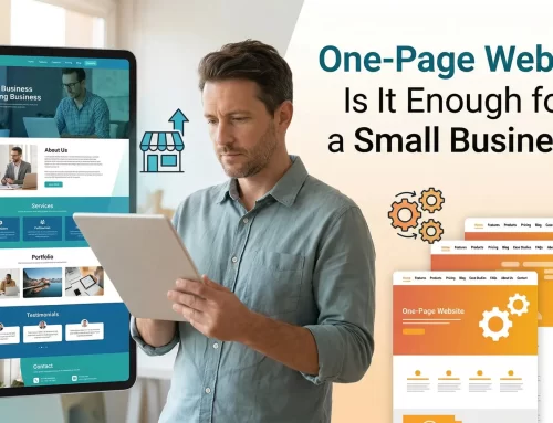
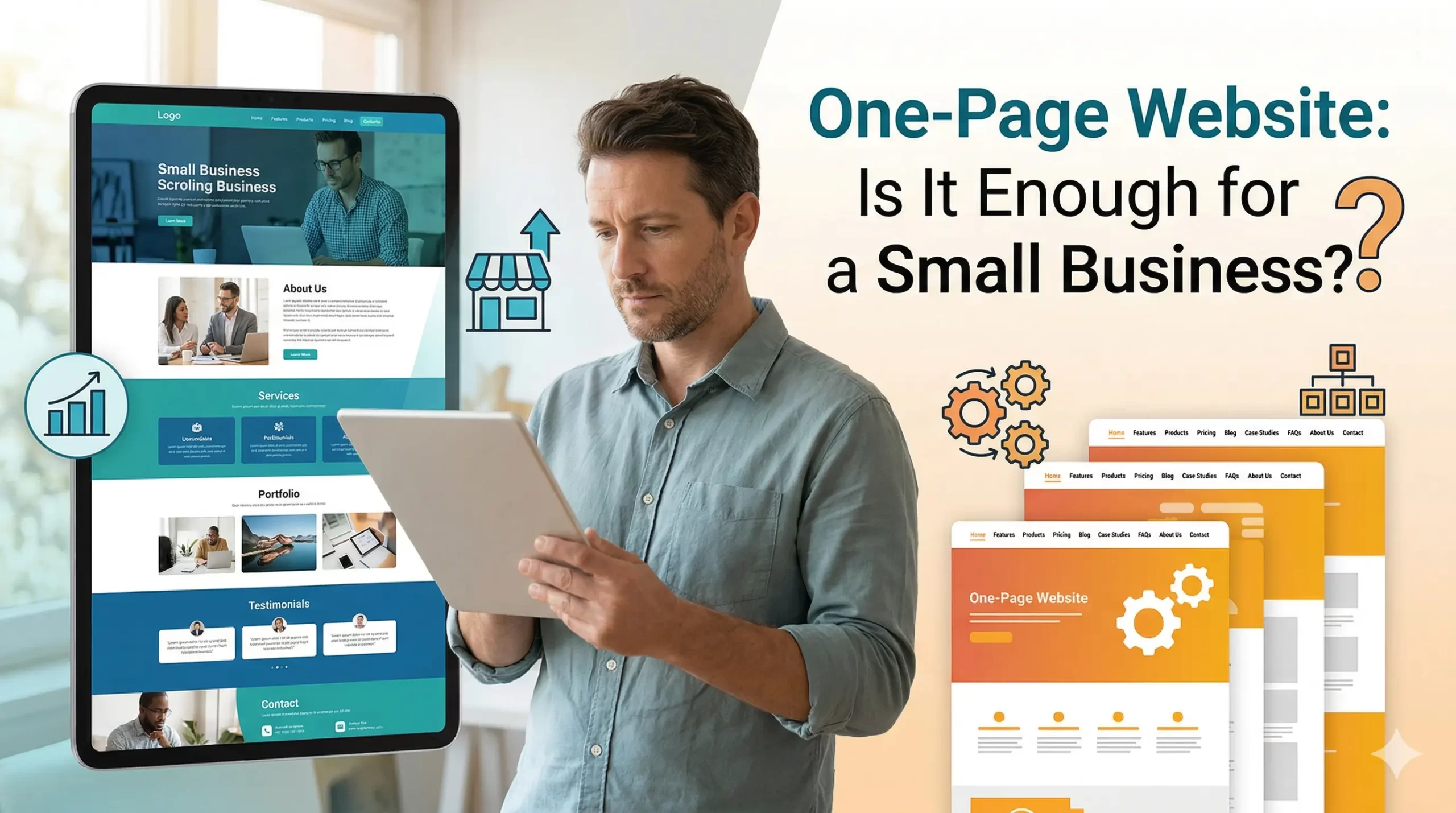
Some businesses also do better with a simpler structure. In some cases, “Is a One-Page Website Enough for a Small Business?” can help you decide if fewer pages would work better.
Adding proof can make a big difference. Testimonials, reviews, client logos, before-and-after examples, and case studies help people trust your business faster.
You should also improve your calls-to-action. Use one main CTA across the page instead of giving people too many options. Make it obvious what you want visitors to do next.
And finally, check the mobile experience. Read your website on a phone. Make sure the text is easy to read, the buttons are easy to tap, and the pages load quickly.
Final Takeaway
High-converting websites are not built around design trends, fancy animations, or complicated features. They are built around trust, clarity, emotion, and action.
A website should help people understand what you do, why it matters, and what they should do next. If visitors feel confused, overwhelmed, or unsure, they leave. If they feel clear, confident, and understood, they are more likely to contact you, book a call, or make a purchase.
That is why conversion is not only about getting more traffic. More visitors do not help if the website is weak. A smaller number of the right visitors can produce better results when the website is built properly.
The businesses that win are usually not the ones with the flashiest websites. They are the ones with websites that feel clear, human, and easy to trust.
Website conversion matters today, but discoverability matters too. Search is changing fast, and businesses now need websites that work for Google, AI search, and answer engines. That is where “SEO vs AEO vs GEO: How Modern Search, AI, and Answer Engines Discover Businesses” connects to the bigger picture.
At Les Creatifs Studio, we believe great websites should do more than look good. They should tell a story, build trust, and help people take action.

